Resource Card Component
Synopsis: The resource card component is an informational card that can may live by itself or with a group of related cards within the page. It is generally used to link to a a resource page such as an article or case study. It has 3 layout variations: Standard, Wide and Wide v2.
To make the card static with no link or hover-state, simply leave the link field blank.
Content Fields:
Resource Type (text and Icon), Image, Title, Description, Eyebrow, CTA link, Video link (optional)
Options:
Layout Option: Standard, Wide, Wide v2
Blur: Optional
Blur bar: Optional
Border: Optional
Is Video: Optional
Text: right/left (applies only to Wide and Wide v2 layouts)
Background: light/dark/Blue (applies only to Wide v2 layout)
Background color: Fiserv color palette.(applies only to Standard layout)
Recommended Image Specifications:
Standard layout: Horizontal image with center focus
Wide layouts: Horizontal image, focus is on the center of the image on desktop and image moves to top with a wider view on mobile
Usage: All pages
- If the description has more text than the space allows, you’ll see an ellipsis (…) to show there’s more content.
Note: This should be used as an example only. There will be additional requirements related to each individual component usage and page design, such as font treatments, padding and margin requirements, ADA compliance etc, so please use the below examples for reference only to demonstrate core function.
Scenario 1
Standard Variation - (with blur, border and background color)
Ingredients: 3 Resource Cards, Column Control, Container
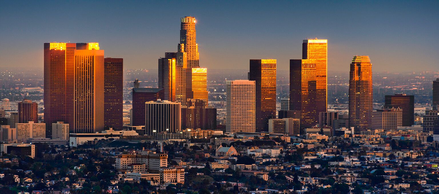
This scenario consists of 3 resource cards in the standard layout inside a 3-column control, all set within an 1170px max-width container. The standard resource card variation consists of the image, resource type and icon, eyebrow text, title, description and CTA properties. In this example the eyebrow is left off. The author also has various alignment properties. The entire card is clickable if the CTA is set.

Scenario 2
Standard Variation - (with blur and border)
Ingredients: 3 Resource Cards, Column Control, Container
This scenario consists of 3 resource cards in the standard layout inside a 3-column control, all set within an 1170px max-width container. The standard resource card variation consists of the image, resource type and icon, eyebrow text, title, description and CTA properties. In this example the eyebrow is left off. The author also has various alignment properties. The entire card is clickable if the CTA is set.
Scenario 3
Standard Variation - (without blur & border)
Ingredients: 3 Resource Cards, Column Control, Container
This scenario consists of 3 resource cards in the standard layout inside a 3-column control, all set within an 1170px max-width container. The standard resource card variation consists of the image, resource type and icon, eyebrow text, title, description and CTA properties. The author also has various alignment properties. The entire card is clickable if the CTA is set.
Scenario 4
Standard Variation - (with Blue bar & border)
Ingredients: 3 Resource Cards, Column Control, Container
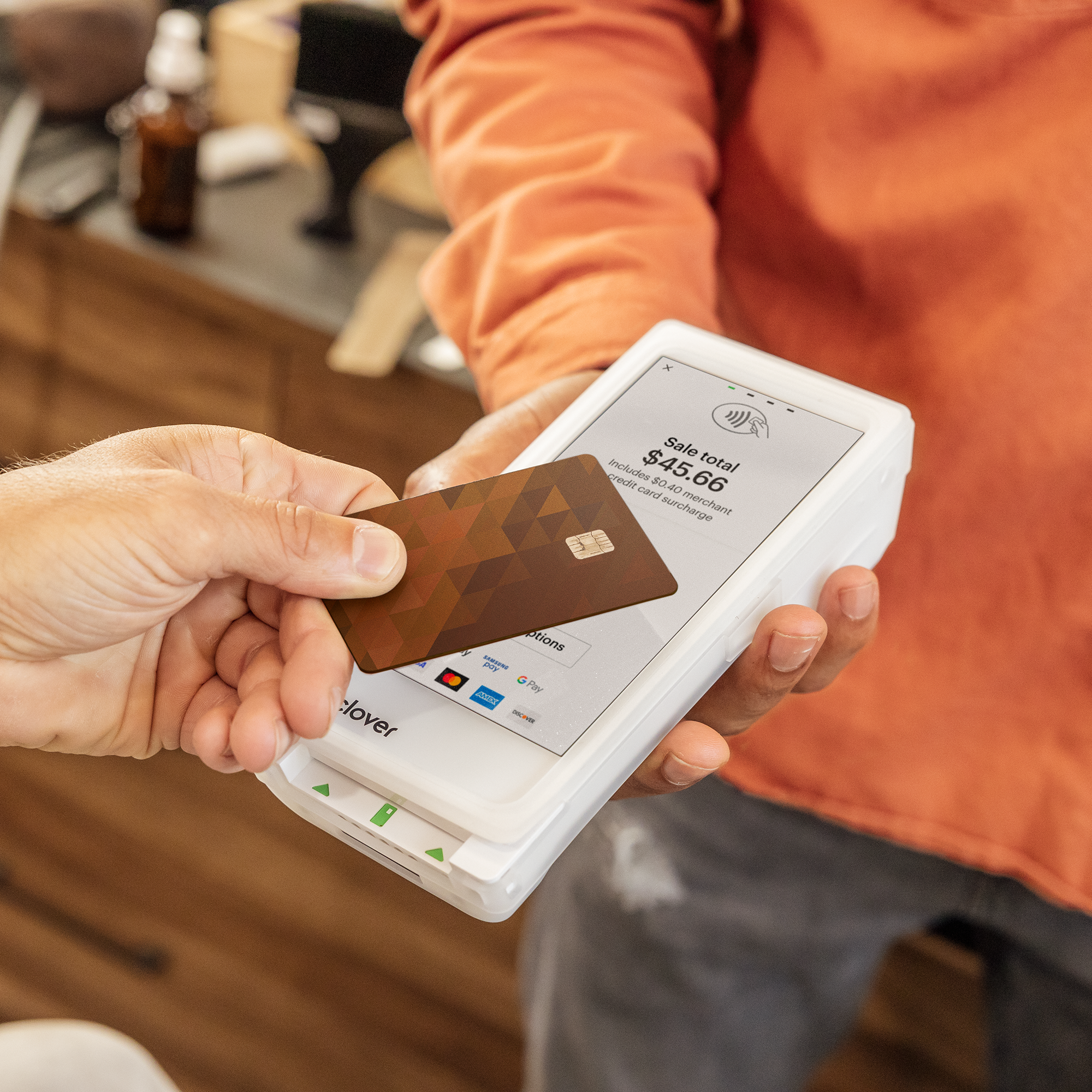
This scenario consists of 3 resource cards in the standard layout inside a 3-column control, all set within an 1170px max-width container. The standard resource card variation consists of the image, resource type and icon, eyebrow text, title, description and CTA properties. The check boxe for Blur bar is chacked. The author also has various alignment properties. The entire card is clickable if the CTA is set.


Scenario 5
Wide Variation/Text Left
Ingredients: 1 Resource Card, Container
This scenario consists of 1 resource card setup in the wide layout within an 1170px max-width container. The blur effect is turned on and the border is turned off.
Scenario 6
Wide Variation/Text Right/With Blue bar
Ingredients: 1 Resource Card, Container
This scenario consists of 1 resource card setup in the wide layout within an 1170px max-width container. The blue bar effect is turned on and the border is turned off.
Scenario 7
Wide V2 Variation - Light Background/Text Left
Ingredients: 1 Resource Card, Container
This scenario consists of 1 resource card setup in the wide layout within an 1170px max-width container. The blur effect is turned on and the border is turned off.
Scenario 8
Wide V2 Variation - Light Background/ Text Left/ With Blue bar
Ingredients: 1 Resource Card, Container
This scenario consists of 1 resource card setup in the wide layout within an 1170px max-width container. The blue bar effect is turned on and the border is turned off.
Scenario 9
Wide V2 Variation - Dark Background/Text Right
Ingredients: 1 Resource Card, Container
This scenario consists of 1 resource card setup in the wide layout within an 1170px max-width container. The blur effect is turned on and the border is turned off. The option for text right is selected.
Scenario 10
Wide V2 Variation - Dark Background/Text Right/ with Blue bar
Ingredients: 1 Resource Card, Container
This scenario consists of 1 resource card setup in the wide layout within an 1170px max-width container. The blue bar effect is turned on and the border is turned off. The option for text right is selected.
Scenario 11
Wide V2 Variation - Blue Background/Text Right/ with Blur
Ingredients: 1 Resource Card, Container
This scenario consists of 1 resource card setup in the wide layout within an 1170px max-width container. The blue bar effect is turned on and the border is turned off. The option for text right is selected.
Scenario 12
Resource card with Video,(This scenario is applicable for for all variants)
Ingredients: 1 Resource Card, Container
Note: For video we need to enable Is video check box should be enabled, and in CTA field we need to author Brightcove video path.
This scenario consists of 1 resource card setup in the wide layout within an 1170px max-width container. The blue bar effect is turned on and the border is turned off. The option for text right is selected and Is video check box is enabled.